The Motion drop zone enables you to view your query in motion, as a series of visualizations. Adding a motion, or play, axis adds visual animations to your charts. Add a date hierarchy to see how your data changes over time.
Using the Motion Drop Zone
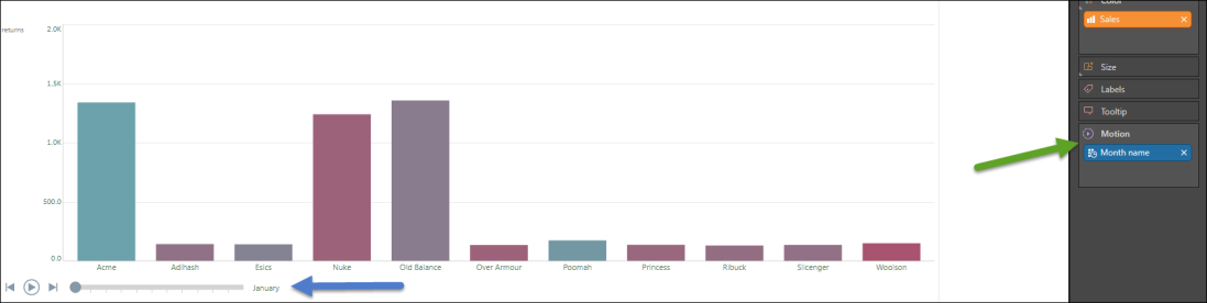
Simply add a member hierarchy to the Motion drop zone (green arrow) to view your query as a moving series of visualizations. For instance, add the month hierarchy to view a series of visualizations, each filtered by a different month, to view changes over time.
Any member hierarchy can be used to animate the visuals, not only date/time hierarchies.
The Motion drop zone is available with Cartesian visuals, which include:
- Column charts
- Bar Charts
- Line charts
- Area charts
- Scatter charts
It is also available when working with maps and scatter charts.
From the motion play bar (blue arrow) you can:
- Play and pause
- Go back to the beginning
- Skip to the end
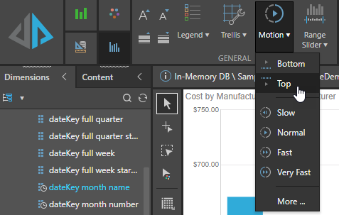
Motion Settings
Use the Motion option on the Component ribbon to configure the Motion player; indicating where to position the player, how quickly to play your animation, and the Font Settings (font, font size, color, and so on) for your player label.
- Click here for more information about these options